
Doctor Who: Prisoners of Time #1
Writer – Scott & David Tipton
Artist – Simon Fraser

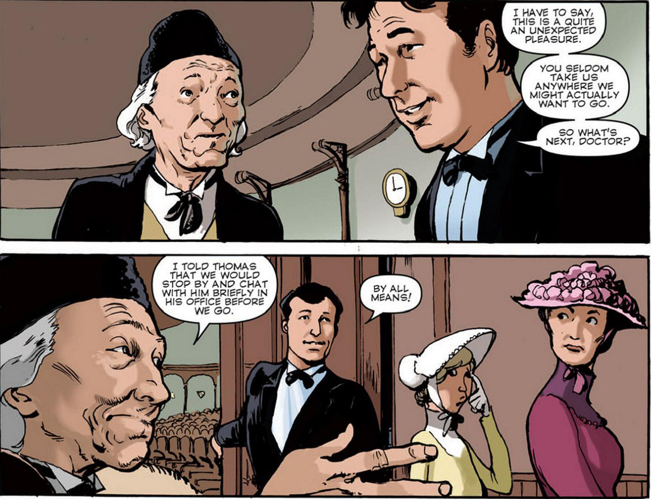
IDW is bringing back all 11 Doctors for the big 50th Anniversary this year. The first issue begins by introducing a mysterious villain that seeks to take away The Doctor’s companions as part of a plan to destroy The Doctor. We then move onto a story featuring The First Doctor along with Ian, Barbara, and Vicky. They are traveling to the year 1868 to meet with Thomas Huxley who has invited them to a lecture. The discussion between the characters is cut short when The Doctor learns that some of Huxley’s students have disappeared. Thus, a rescue mission begins with The Doctor facing a classic enemy from the 60s. The story concludes with a minor cliffhanger that hints at the overarching story of the series.
The writing did fit with the style from the early seasons of the TV show with one major exception. On a number of occasions The Doctor mispronounces Ian’s last name. If you are a fan of the old series then you probably know that The First Doctor had respect for Ian after some of the early adventures. It is really out of character for The Doctor to not call Ian by either name properly. They were the two main heroes of the early seasons thus it feels odd having The Doctor insult Ian. Also, in this story the companions really did nothing while in the old show they often solved as many problems as The Doctor. Beyond those minor gripes all the characters did have accurate mannerisms and it was nice seeing The First Doctor in action once again.

The art is above average, but has several flaws. The first flaw is that the art is very plain. While the early seasons where almost entirely done on sound stages they were still decently decorated. So, if this is meant to be a throwback it does not fit with the bland designs. If it is not a throwback then it is lazy and unpolished, either way this is a flaw. Some of the facial expressions look really silly and sometimes do not really fit the situation the character is facing. On the good side the characters do look like the original actors, the Zarbi look well drawn. In addition, the action (what little there is) looks passable and show potential. The art does not ruin this issue, but it would be nice to see it improve.

This issue will make fans of the old school Doctor Who seasons happy despite the flaws. It is nice to see some classic characters in the comics, which is something that should happen more often. As this story will follow the different incarnations it is hard to say if this will remain an interesting series. However, with the possibility of The Doctors teaming up to face the mysterious villain it could have an exciting ending. It would have been nice if the writing and art were a little cleaned up and accurate, but most falws can be overlooked. If you are a new school fan this is a great way to get introduced to the classic characters if you are an old school fan this is the best you are going to get beyond the “Doctor Who Classics” that are released from time to time.

Final Verdict:
4 out of 5 – One of the better Doctor Who comics I have read